Sustainable graphic design is often overlooked when we talk about sustainable packaging.
Most of the people only think about sustainable materials like biodegradable and compostable ones.
Yes, selecting proper materials is important, but they are not everything to achieve sustainability.
Role of sustainable graphic design on packaging is often ignored, like the colours, typography, imagery, layout and messages that are printed on the packaging.
At a glance, its look so small, but they have a significant impact on the environment and consumer perception.
In this blog, we will explore the meaning of sustainable graphic design and understand how colours, typography and material choices help to communicate sustainability in a simple and honest way.
Introduction
What is Sustainable Graphic Design in Packaging?
Sustainable graphic design in packaging means giving the look to the packaging in a simple and clear way without harming nature.
It is about how colours, text, images, layout and printing methods are used.
Let’s understand it with an example, imagine two soap boxes that are made from the same recycled paper.
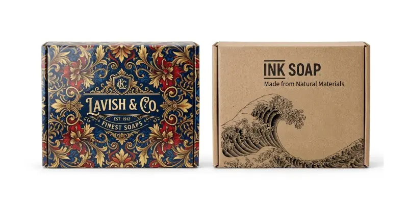
The first box is fully covered with heavy colours, shiny coatings, different patterns and decorative images. While the second box uses minimal colour, clear text, simple graphics and functional illustrations on un-bleached paper.
Both use the same eco friendly material, but the second one will be considered as a sustainable graphic design because it prints less, uses fewer resources and communicates transparency.
In simple terms, sustainable graphic design means:
• To avoid unnecessary decoration, excess ink and visual tricks
• Use fewer resources
• Communicate clearly and quickly
• Avoid greenwashing
It is important to communicate sustainability messages quickly because most buying decisions happen in a few seconds in the crowded markets, like supermarkets, retail shelves, online grids or local stores.
People scan the products, not read their labelling details.
This is why sustainable graphic design for packaging is crucial.
Sustainable Graphic Design Principles
Sustainable graphic design is not all about making a “green look” or putting environmental claims on the packaging.
It is about making thoughtful designs that reduce waste, communicate honestly and stay effective for a longer time.
At its core, sustainable graphic design can be done by applying a few simple and powerful principles.
1. Less decoration, ink, colour, icons and coatings
One of the most important principles of sustainable graphic design is reduction.
This means by using fewer colours, less ink, fewer decorative elements and avoiding unnecessary finishes like foil stamping, laminations or heavy coatings.
Every extra colour, pattern, icon or finish increases material use, energy consumption and environmental impact.
Though decorative packaging may look attractive, but it often comes with a hidden cost.
To design a sustainable packaging asks a simple question: Is this graphic necessary for the product presentation?
Packaging artworks that use limited colour palettes, simple layouts, clean typography and minimal icons are good for the environment and deliver the sustainability message quickly and confidently.
2. Go with the Material Reality
In sustainable packaging, we often use recycled paper, kraft board, un-bleached paper and compostable materials.
These materials have natural colours, textures, fibres and imperfections and these qualities should not be covered up with heavy ink and coatings.
When heavy ink printing or glossy visuals hide the real material, the sustainability message becomes less visible.
Transparent design allows the consumer to see and feel what the packaging is made of.
Visible fibres, neutral colours and raw textures communicate transparency without hiding the material reality with shiny varnishes or coatings.
This material honesty builds trust in the consumers.
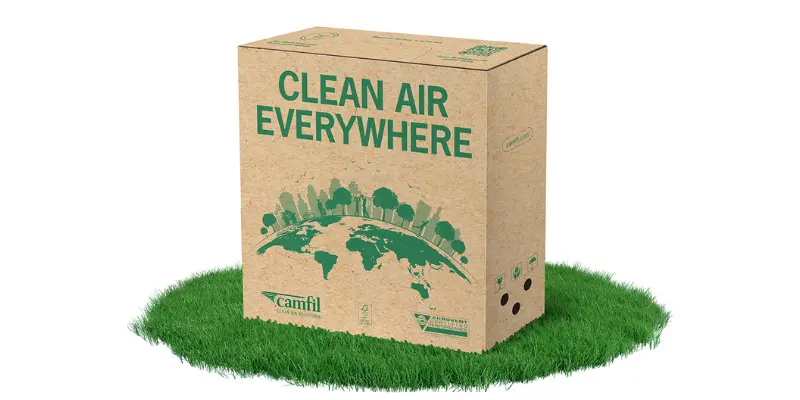
Example: Camfil & Stora Enso
A practical example of “material reality” in sustainable graphic design comes from the collaboration between Camfil and Stora Enso.
They replaced traditional white corrugated boxes with natural brown kraft packaging.
Instead of bleaching the paper to achieve a clean white look, they kept the material in its original form.
This decision not only reduced the need for chemicals, energy and water during production but also lowered overall carbon emissions.
From a graphic design perspective, the packaging avoids heavy ink coverage and glossy finishes.
The natural brown colour, visible fibres and raw texture are left exposed, allowing the material itself to communicate sustainability.
This is a strong example of design that does not hide the material but highlights it.
By aligning graphics with the natural appearance of the substrate, the packaging becomes more honest, simple, and transparent.
Such material honesty builds trust with consumers, as they can clearly see and feel the sustainability behind the packaging instead of relying on printed claims.
3. Go with Standard Design, Not for Trendy
Sustainability is a long term thinking and graphic design should reflect that.
Trendy graphic design in packaging often look attractive, but remain ineffective after some time.
Frequent change in designs lead to excess waste, material destruction and reprinting.
Sustainable graphic design focuses on system-based approach, not trend driven.
Clean typography, restrained colour use, simple layouts and strong systems stay longer than fashionable graphics.
A design that remains effective even after 5 years is more sustainable than a design that looks outdated in just 6 months.
In summary, sustainable graphic design is not about using just green colour for brands. It is about reducing excess, respecting materials and designing for the materials for longer time.
Role of Colour in Sustainable Packaging Design
Colour plays a powerful role in how people understand sustainability, even before they read a single word.
In packaging design, colour is one of the first elements the human eye notices.
It sets expectations, creates emotional responses and builds trust. So, when used thoughtfully, colour becomes a strong tool to communicate sustainability.
But when misused, it becomes a greenwashing.
Beyond Green Colour

Since long, green has been used as the default colour for sustainable products.
Green colour symbolise nature, so many brands are using bright green colours and leaf graphics even though their products are not truly sustainable.
As a result, consumers’ trust is diluted for green packaging because sustainability is beyond this green colour.
Select Colours from the Nature (Nothing New Under the Sun)
One of the best ways to select colours are from natural materials or nature itself.
Common sustainable colour choices include:
• Kraft brown and natural paper tones (Off White)
• Off white, cream and unbleached shades (Without Excess Treatment)
• Clay reds and earth browns
• Stone greys and soft mineral tones
• Charcoal black instead of pure black
These colours work well because they reflect minimal processing and allow the packaging material to look natural.
Use of Muted Colours
Sustainable packaging often uses muted or desaturated colours rather than bright and highly saturated colours.
Soft tones create a sense of calm, care and responsibility. They reduce visual stress and allow the consumer to focus on essential information. This is crucial for designing pharmaceutical products.
Muted colours also suggest restraint—one of the core values of sustainability.
They feel mature, trustworthy and less promotional compared to loud, attention seeking colour palettes.
Limited colour palettes for lower impact
Using fewer colours is a simple but powerful sustainability signal. A limited colour palette:
• reduces ink usage
• simplifies printing
• avoids unnecessary visual noise
• improves readability
• communicates restraint and clarity
Many sustainable packages use just one or two colours, sometimes even a single colour paired with the natural material.
This approach shows confidence and reduces environmental impact without compromising design quality.
In sustainable packaging, colour should never exaggerate or mislead. It should support the truth, not replace it.
Typography (Creating a Sustainable Voice Through Type)
In sustainable packaging design, typography plays a crucial role in communicating honesty, clarity and responsibility.
The way letters look, the spacing between words and the overall tone of the typeface all influence how sustainable a product looks, even before the message is read.
Sustainable typography focuses on clarity over decoration.
Clean, readable typefaces help to consumers quickly understand what the product is and what makes it responsible.
Overly decorative, exaggerated or trendy fonts may look attractive, but they often distract from the message and reduce trust. In sustainability, trust is more important than style.
Simple, well-balanced typefaces communicate transparency.
Additionally, fonts that are easy to read at small sizes are important because sustainable packaging often uses recycled or textured materials where thin or fancy fonts can become difficult to read.
Clear typography respects all users, including older consumers or those with visual difficulties.
Another key aspect of sustainable typography is restraint.
By using one or two typefaces, avoiding unnecessary bold styles and keeping the hierarchy clear, we can reduce visual clutter.
This mirrors the core sustainability principle of “Saying More with Less”.
Take an Example of MUJI
MUJI is a strong example of sustainable typography in the real world.
This brand uses very simple, neutral typefaces with no decorative elements. Their packaging avoids bold claims and flashy fonts. Instead, the typography is quiet, functional and clear.
This approach reflects MUJI’s philosophy of minimalism, material honesty and long term usability.
When type is used thoughtfully, it becomes a powerful tool for communicating sustainability without saying too much.
Powerful & Minimal Illustrations Over Stock Images
In sustainable packaging design, illustrations can communicate far more effectively than stock images—especially when they are powerful and minimal.
While stock images of leaves, forests or water drops may seem convenient, they have become overused and predictable.
Many consumers are now using this for their marketing tactics rather than real sustainability, which reduces trust.
Minimal illustrations, on the other hand, feel intentional and honest.
They focus on explaining ideas rather than decorating the packaging.
Simple line drawings, icons or abstract shapes can show processes like reuse, recycling, refilling or production steps much more clearly than photographs.
They work quickly, visually and across languages, which is essential in busy retail environments.
From a sustainability point of view, minimal illustrations also require less ink and fewer colours, supporting low impact printing.
Take an Example of IKEA
IKEA is a great example of using minimal illustrations instead of stock imagery.
Across its packaging and instruction manuals, IKEA relies on simple line illustrations to explain assembly, usage, recycling and product care.
These visuals are clear, universal and free from decorative excess. They focus purely on function and understanding.
IKEA’s illustrations do not try to “look natural” with trees or leaves.
Instead, they communicate sustainability through clarity and systems thinking—showing how products are used, disassembled or reused.
This approach builds trust and reduces the need for long explanations.
What to Do and What Not to Do in Sustainable Graphic Design
Design plays a powerful role in how sustainability is perceived. Small visual decisions can either build trust or create doubt.
Here are some clear do’s and don’ts to help graphic design genuinely reflect sustainability.
What to Do
1. Design with less
Use fewer colours, less ink and minimal decoration. Simplicity reduces carbon footprint.
2. Let materials speak
Allow recycled paper, kraft board or uncoated textures to remain visible. Don’t coat them with heavy ink and coatings.
3. Communicate one clear message
Focus on a single, meaningful sustainability claim
4. Use readable typography
Choose simple, legible typefaces that work well on recycled or textured surfaces.
5. Use illustrations purposefully
Prefer minimal illustrations or icons that explain reuse, recycling or processes. Use icon or illustration which has some meaning for the packaging.
6. Design for Generation to Generation
Create timeless designs and flexible systems that don’t need frequent redesigns.
What Not to Do
1. Don’t overload eco claims
Too many badges, symbols or claims confuse consumers and reduce credibility.
2. Don’t rely only on green colour or leaf graphics
Green visuals without real substance often signal greenwashing.
3. Don’t hide sustainable materials
Avoid heavy ink, glossy finishes or full-coverage printing that contradicts eco materials.
4. Don’t use decorative visuals without meaning
Every graphic element should serve a purpose, not just to fill negative space.
5. Don’t follow trends blindly
Don’t follow trends blindly; trend-heavy designs age quickly and increase redesign waste, leading to unnecessary environmental impact and resource consumption.
Conclusion
Sustainable graphic design is not just about making packaging look green, but about making it honest, simple and responsible. Every design choice—colour, typography, material visibility and printing—has an environmental impact. By using less ink, avoiding unnecessary decoration and respecting the natural look of materials, we can reduce waste and communicate sustainability clearly. Simple designs also build stronger trust with consumers because they feel real and transparent. In the future, brands that focus on clarity, material honesty and long-term design will stand out. Sustainable packaging is not only about what we use, but also about how we design it.